
SeiBella Waxbar
Redesigning the homepage to drive in new visitors, find its brand voice, and establish trust for a local small business
Project Overview
SeiBella Waxbar is a locally-owned small business in the outskirts of Chicago that specializes in various waxing services, facials, and skincare. I led the project to redesign SeiBella Wax Bar's homepage with the goal of attracting new visitors and fostering trust in the brand. The focus was on creating a feminine, fun, and user-friendly design that reflected SeiBella's commitment to quality, professionalism, and playfulness. Having easy-access to the booking system would be a priority for this project in order for visitors to make appointments right from the homepage.
Using the client’s goals and user findings, I carefully crafted a layout that showcased SeiBella's services, promotions, and customer testimonials prominently on the homepage. By incorporating appealing visuals and clear calls-to-action, we aimed to guide visitors to explore the website further and ultimately book an appointment.
To establish trust, we highlighted SeiBella's expertise, hygiene practices, and customer satisfaction rates. Testimonials and before-and-after images were strategically placed to reassure potential customers of the quality of service they could expect.
The redesigned homepage aimed to create a welcoming and informative entry point for visitors, ultimately driving increased traffic and conversions for SeiBella Wax Bar.
Summary
Role: UX designer, copywriter, content designer
Team: UX Lead + 3 UX designers
Timeframe: 2 months
The Work: audit, content design, copywriting, UX|UI design
The Outcome: 271% increase in engagement
Business Goals
To do a redesign of SeiBella Waxbar’s homepage, and increase site traffic and engagement
UX | Content | Copywriting Goals
To redesign SeiBella Waxbar’s entire homepage, refine the branding palette, and create the content and copywriting for the business, ensuring that the brand has a voice that ensure trust and playfulness
Main Tasks & Challenges
After meeting with the owner of SeiBella Waxbar, we reviewed goals for the business and goals for the UX and content design. We decided to focus on the following tasks:
Clean Up UI
Remove unnecessary elements that do not reflect SeiBella’s image and brand, improve hierarchy, and fine-tune its color palette
Improve UX
Make sure that the homepage contains a CTA at various touchpoints for easy access to the booking system and updated store.
Content Design
Create the brand voice for SeiBella Waxbar that contains no typos, establishes trust for the customer, and carries an air of playfulness in the tone while maintaining professionalism
Problem
After the initial meeting with the owner of SeiBella Waxbar, it was brought to my attention that typos were a major drawback to the homepage and that the brand voice lacked the fun, trustworthy, and professionalism that reflects what SeiBella is. Along with this were the low traffic and high bounce rates due to unfinished UI that led to SeiBella’s booking system. It was evident that the homepage lacked hierarchal structure needed to make for an eye-catching page. While the homepage is very welcoming with a lovely affirmation, several elements needed updates and proper structure.
I hit the ground running by beginning an audit and competitive analysis to see what my findings were and use the website’s analytics to my advantage.

Process
1
I began with exploring and reviewing all the details I had received from the client. I proceeded with an audit of the SeiBella Waxbar homepage and created a competitive analysis. I used the website’s analytics, customer reviews, and market research to create this analysis.
This helped with seeing the bigger picture of what could be done for the homepage’s redesign.
I then began with removing unnecessary elements that impeded the user from having a great user experience and kept the welcoming affirmations that reflected the brand.

2
Next step was to create a welcoming headline to give a more polished and professional design. Because SeiBella prides itself in providing a safe and comfortable space for clients while helping them feel beautiful, I decided to keep the lovely affirmation for the visitors that says, “You are beautiful.”
Since there were little to no photos of the inside of the salon, I added a photo of one of the spa rooms to establish a sense of trust for the visitor.
The soft pink was now a more hot pink to reflect the hot pink elements featured inside the salon and to be more consistent with the brand palette.
These subtle but impacting changes were gladly (and quickly!) approved by the client. The homepage was beginning to take shape. Since there were many typos and a lack of a brand voice and tone to the home page, some content design was needed.

Desktop view of redesigned menu and homepage
3
SeiBella’s original tone and voice was very casual. SeiBella’s owner trusted me with fine-tuning the voice and tone to make it more professional, bright, trustworthy, and welcoming.
The client loved the phrase “Breathe, Wax, Relax” throughout the homepage as comfort was something she wanted to emphasize and was important to her clients as well.
Along with adding some new content and brand voice, I added a CTA for easy-access to the booking system. The previous design’s CTA button did not meet Ay11 requirements and was difficult to find for the user.
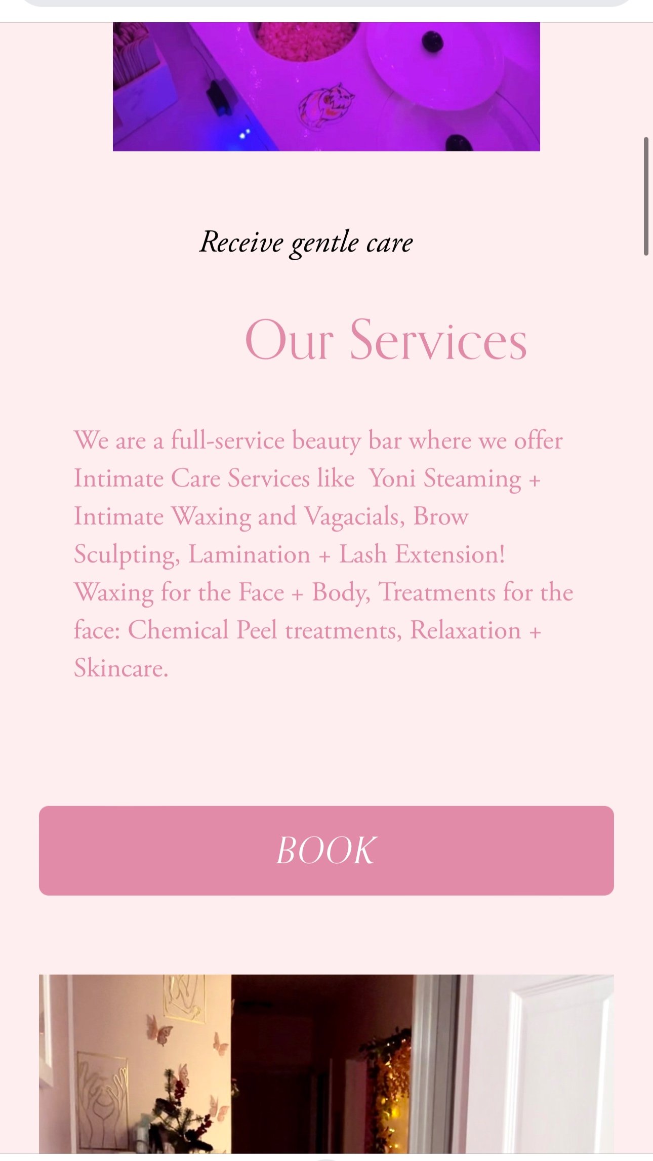
Evidenced in the second mobile sample view is a newly-designed section in the homepage that features categorically SeiBella’s services along with another CTA for easy booking.
Because SeiBella’s owner will now offer a skincare line, I created the copy for the skincare products section along with a CTA to connect the user to the SeiBella online store.

Mobile view of the homepage and CTA
271% improvement in engagement in one month after the new design and copy was released.
Results
268% increase in page visits
31% decrease in bounce rate