RDAV Church
Mobile App & Site
Concept exploration with research paving the way to real insights

Project Overview
RDAV Church, located in Chicago’s southwest suburb of Oak Lawn, IL is a church that is multi-generational, bilingual, and multicultural that serves the Hispanic/Latino community in the area. RDAV Church already had a fully functional and fully designed website but wanted to explore a mobile app release.
By applying research methodologies such as surveys, I helped RDAV Church identify some pain points within the
user experience of the website.
Although the concept of an app was explored, researched, and designed; research indicated that RDAV Church could simply improve upon the current website that will allow the visitors to still have an enjoyable experience with several feature integrations.
Summary
Role
UX Designer
Timeframe
4 months
The Work
User research, online survey, paper sketches, high-fidelity wireframes, prototyping
Outcome
Concept project that pivoted into a real-world website project indicated by the finding of user pain points. Stakeholders open to various integrations within the next year.
Business Goals
Create a concept app for possible launch of RDAV Church’s mobile app
UX Design Goals
Find user pain points and find user wants and needs for its app
The Process
-
User research, conversations, and online survey
-
Sketches, wireframes, prototyping
-
Although a high-fidelity wireframe and prototype was complete, this project pivoted into a real-world case that helped stakeholders identify an actual pain point: lack of online donation feature integration.
Problem Identification

User Research: Survey
I began this project by creating a survey through Google Forms to find out exactly what the congregants would like to see in an application.
Participants were asked the following questions:
What would prompt you to use the RDAV Church app?
Which of the following features would be MOST important for you to see in the RDAV Mobile app? You can make up to 4 selections:
Based on the selections most important to you from question #2, describe how you would use those features in the app:
Please describe any other comments you'd like to share regarding the RDAV Church app:
I asked a sample group of 10 people to take the survey and 7 responded — with 1 of the 7 participants who took the same survey in Spanish. Although such a small group took this survey, all 7 participants (100%) agreed on options for event pages and online donations.
What Users Are Saying
“Pressing subscribe now gives an error ‘Item is not available for sale’. I do not get a “and you are done” message. The process stops on this page.”
“The ‘informational messages’ sounds like spam. Maybe make it explicit you will NOT send commercial messages.”
Our UX Design lead briefed the team on feedback given from testers. Here are what a few users had to say about the previous Gabriel designs:
“Swiping does not work if you try it below the three ‘balls’.”
Current State Screenflows

After the heuristic analysis guided the team into the ideation and design phase, I hit the ground running by developing screen flows of the Gabriel app’s current state. The screenflow painted a larger picture of the issues or anomalies surrounding the app’s current user experience design and UI design such information architecture and contrast issues.
This guided us into creating a more intuitive and accessible
user interface. Seeing the big picture is important, and it helped the team when it came time to design mockups.

Mockups
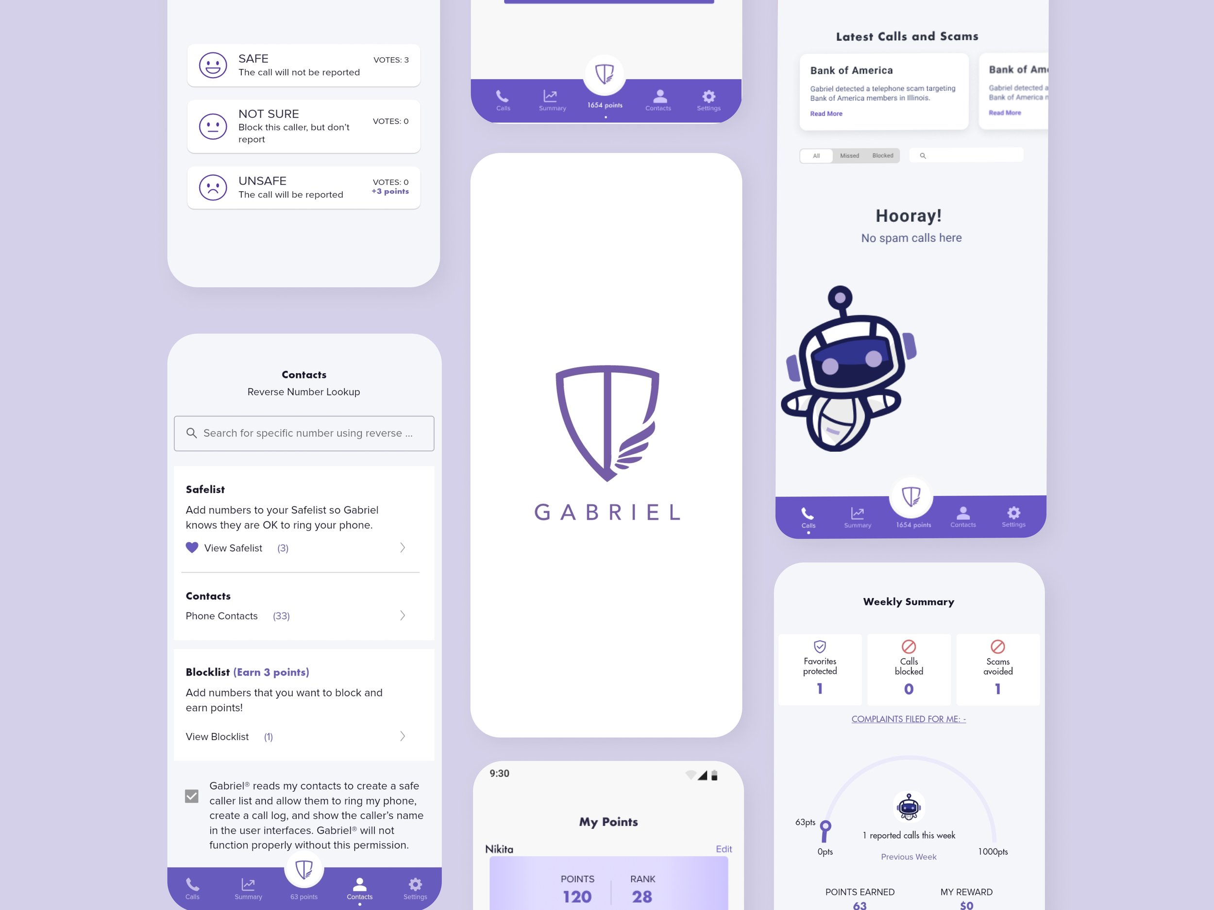
I designed 4 high-fidelity mockups of the Gabriel’s Settings screen. Cleaner and brighter, the UI was taking shape. My mockup designs included a white background with a contrasting purple font face for better accessibility, designed contrasting toggles and typography, and the visual hierarchy was more clear.
These mockups were presented to the stakeholders and they approved the white background with purple accents (some accents a little darkened later), thus, removing the darker gradient background that caused much of the app’s accessibility problems for users.
Little steps make big differences along the way. After much going back and forth, as well as more updated designs from the team, the entire Gabriel app had begun to take shape.

High-fidelity Screenflows

After my mockups were approved by the stakeholders, I was then able to keep going with the project by creating another screenflow. This time it was of the newly-designed screens. The flow of the customer journey was now more seamless and straightforward. The contrast was better and my designs met A11y standards.
Having the information architecture now organized by the team, creating the screenflows was a less arduous task. Creating a prototype would show us overall how well the contrast is.

Settings Screen Prototype
I was tasked with creating an early prototype of one of the Settings screen mockups I had worked on earlier in the project. We wanted to see how the toggles would look and what best toggle styles could be chosen based on the new changes in the contrast of the Gabriel app’s UI design. Another thing we were to look out for was visibility of system status marked by the small line under the settings screen — this was later changed to a minimalist style in the form of a dot.
A key issue for stakeholders was the use of the “swarm” game which was featured in the earlier designs of Gabriel. That feature was changed to the “Points” feature which would showcase the user’s total points based on how many spam calls they have reported as spam — thus, continuing the gamification and rewards features that is are a selling point for Gabriel. Each spam call rating from the user equaled 3 points. These points go toward a gift card or crypto currency.
UH-OH!


Lexicon Became a Priority
UX Writing: While we continued to work on each screen for the Gabriel app, we encountered some issues regarding the verbiage of “whitelist” and “blacklist”. Changing this antiquated lexicon then became a high-priority. I took the liberty of changing “whitelist” to “safelist”, and “blacklist” to “blocklist” as placeholders. I used these 2 terms as they align with the purpose of Gabriel which is to keep the customer safe from spam calls and having a list of approved contacts, while also having the power to block spam or robocalls. Stakeholders later approved of these 2 terms and are now featured in the current Gabriel app redesign. This decision resulted in a more equitable design for the users of Gabriel.
Final Thoughts
The initial phase of the project was complete and the Gabriel project was then completed by the rest of the team. Our designs, both UX and UI, paved the way for how the app looks and functions today. Gabriel Robocall Blocker was relaunched in fall of 2022 and it is currently at over 100,000 downloads on Android iOS.
Key Takeaways
-
Trendy UI ≠ Better Results
Always do research. Following trends in UI design will not equate to an excellent user experience for the user. If the UI provides an excellent experience, customer loyalty can increase. Thus, customer loyalty can cause a positive outcome for the brand or company’s bottom line.
-
Accessiblity
Accessibility and equity are to be kept at the top of the priority list for any design project and can help lay a good foundation in the UX writing sector.
-
Communication
Keeping in touch with stakeholders and their needs helps in better meeting business objectives while meeting UX design goals.