
Meet Gabriel™ Crypto, your scam call & SMS phish detector
Redesigning the way users can block scam calls using gamification & simple UI.
Project Overview
Gabriel™ Crypto is a mobile application for Android (and soon, on iOS) that blocks spam calls, robo calls, and helps the customer avoid fraud numbers and spoof calls all while rewarding its users with cryptocurrency. Gabriel™ does this by leveraging crowdsourced threat data. ForwardEdgeAI tasked me and my team with redesigning Gabriel™ Crypto’s original mobile design for a cleaner and more easy-to-use UI that doesn’t compromise its selling point: cryptocurrency rewards for its users.
With empathy and accessibility in mind, I was able to take part in helping Gabriel™ Crypto in analyzing key issues that would help in redesigning it into a more user-friendly, accessible, and fun application.
Through this, ForwardEdgeAI has launched the redesign of Gabriel™ and can continue to keep users safe from spam calls while staying ahead of its competitors by leveraging crowdsourced threat data and being the only SMS phishing detection product on the market powered by cryptocurrency.
Summary
Role
UX designer
Team
UX Lead + 3 UX designers
Timeframe
4 months
The Work
heuristic analysis, high-fidelity wireframes, prototyping, screen flows, UX writing
The Outcome
Redesign launch fall 2022
Business Goals
Worldwide release of Gabriel Robocall Blocker app for Android
UX Design Goals
Full redesign of the Gabriel™ Crypto and removal of “Swarm” integration
Besides detecting spam and phish scams, Gabriel™ Crypto detected problems—this time with its user interface and user experience. We came in and helped.

Solution
We gave Gabriel™ Crypto a clean interface that is fun, accessible, and more useful than ever before.
Main Tasks & Challenges
After reviewing stakeholder and business goals along with heuristic analysis of the original UI,
the team and I concluded on focusing on the following UX/UI tasks:
Update UI
Develop a clean, visual interface that meets accessibility standards
Improve UX
Eliminate hurdles, confusion, and unnecessary tasks within the user’s experience based on user research and heuristic analysis
Remove Old Functions
Remove the “Swarm” game to prioritize Gabriel™ Crypto’s rewards
and cryptocurrency features.
Problem Identification
Accesiblity Issues: Hard-to-Read Font

Before proceeding to ideation and design, the UX design lead and I conducted a heuristic analysis of Gabriel’s current state. The heuristic analysis results showed 6 usability violations. These violations included: visibility of system status, and aesthetic and minimalist design. The early UI design of Gabriel seemed to have followed trendy styles which won’t always work for each company or brand.
The heuristic analysis enabled us to create a UX strategy that would help users have a positive relation with the Gabriel app as well as meet the stakeholder objectives of redesigning the entire app.
We now had a great strategical foundation to get started and take the next steps.
What Users Are Saying
Our UX Design lead briefed the team on feedback given from testers.
Here are what a few users had to say about the previous Gabriel designs:
“1. Pressing subscribe now gives an error ‘Item is not available for sale’. I do not get a “and you are done” message. The process stops on this page.”
2. “The ‘informational messages’ sounds like spam. Maybe make
it explicit you will NOT send commercial messages.”
3. “Swiping does not work if you try it below the three ‘balls’.”
The Process
Roadblocks in the Userflow

After the heuristic analysis guided the team into the ideation and design phase, I hit the ground running by developing screen flows of the Gabriel app’s current state. The screenflow painted a larger picture of the issues and anomalies surrounding the app’s current user experience design and UI design such information architecture and contrast issues.
This guided us into creating a more intuitive and accessible user interface. Seeing the big picture is important, and it helped the team when it came time to design mockups.
Visual Hierarchy Improvements Needed
I designed 4 high-fidelity mockups of the Gabriel’s Settings screen that included:
better accessibility
designed contrasting toggles and typography
clear visual hierarchy
These mockups were presented to the stakeholders and they approved the white background immediately — thus, removing the gradient background that caused much of the app’s accessibility problems for users.
Little steps make big differences along the way. After much going back and forth, as well as more updated designs from the team, the entire Gabriel app had begun to take shape.
Making It All Come Together

After my mockups were approved by the stakeholders, I was then able to keep going with the project by creating another screenflow. This time it was of the newly-designed screens. The flow of the customer journey was now more seamless and straightforward. The contrast was better and my designs met A11y standards.
Having the information architecture now organized by the team, creating the screenflows was a less arduous task. Creating a prototype would show us overall how well the contrast is.
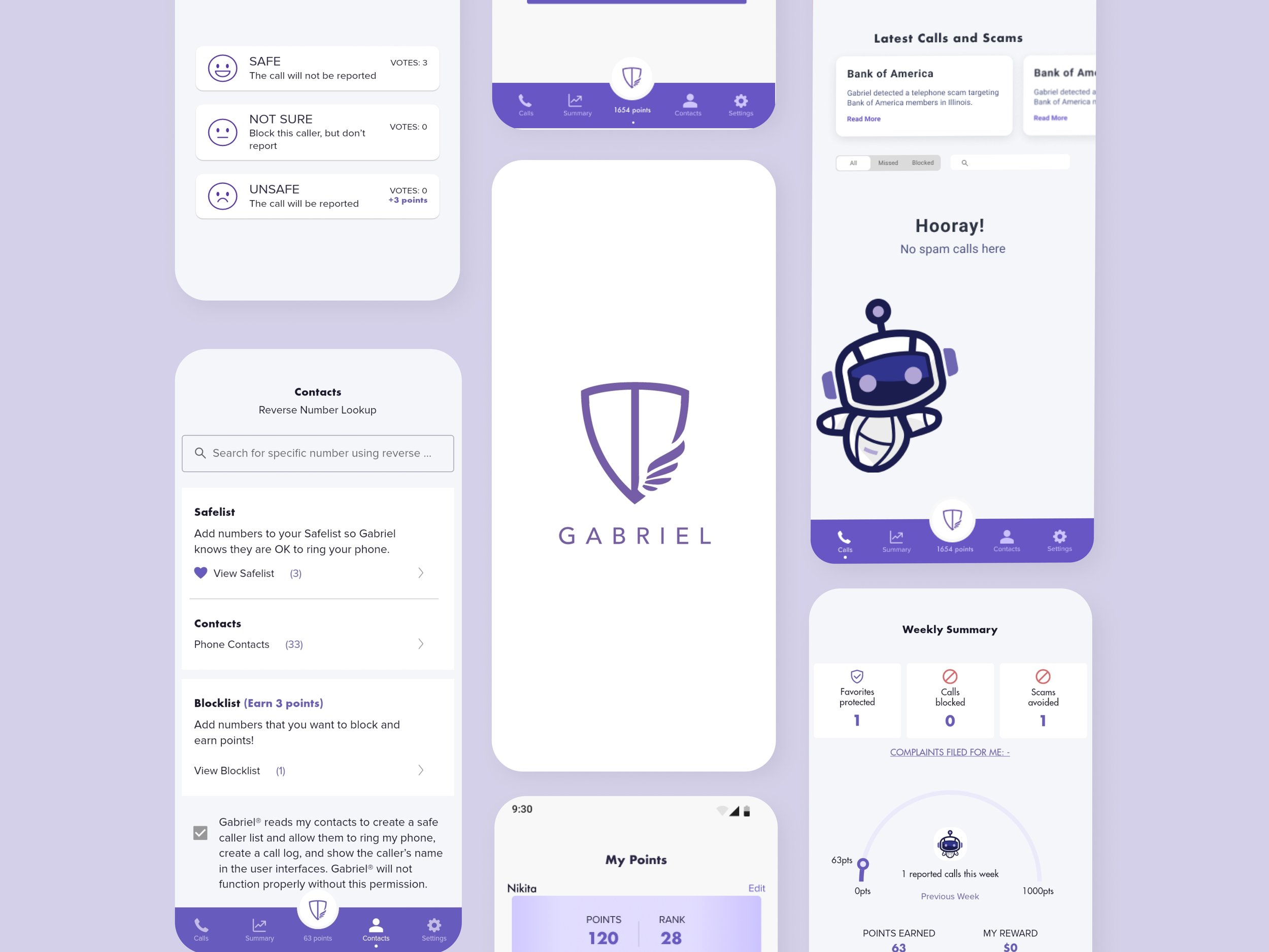
Settings Screen Prototype
I was tasked with creating an early prototype of one of the Settings screen mockups I had worked on earlier in the project. We wanted to see how the toggles would look and what best toggle styles could be chosen based on the new changes in the contrast of the Gabriel app’s UI design. Another thing we were to look out for was visibility of system status marked by the small line under the settings screen — this was later changed to a minimalist style in the form of a dot.
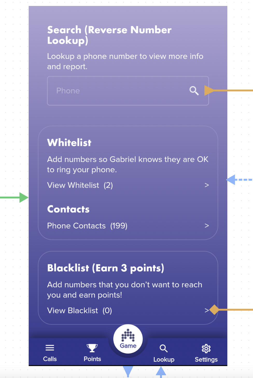
A key issue for stakeholders was the use of the “swarm” game which was featured in the earlier designs of Gabriel. That feature was changed to the “Points” feature which would showcase the user’s total points based on how many spam calls they have reported as spam — thus, continuing the gamification and rewards features that is are a selling point for Gabriel. Each spam call rating from the user equaled 3 points. These points go toward a gift card or crypto currency.
UX Writing Obstacle

Lexicon Became a Priority
UX Writing: Changing antiquated lexicon became a high-priority. I personally took the liberty of changing “whitelist” and “blacklist” to “safelist” and “blocklist” respectively as placeholders.
I used these 2 terms as they align with the purpose of Gabriel which is to keep the customer safe from spam calls.
Stakeholders later approved of these 2 terms and are now featured in the current Gabriel app redesign. This decision resulted in a more equitable design for the users of Gabriel.
Final Thoughts
Although the design phase was completed by my team and then handed off to the next round of designers, our designs, both UX and UI, paved the way for how the app looks and functions today. Gabriel Robocall Blocker was relaunched in fall of 2022 and it is currently at over 100,000 downloads on Android iOS.
Takeaways
-
Post-Launch Testing
Something I would like to have done had I had the time was to do testing of the product after launch to see what needed to be improved in my design.
-
Trendy UI ≠ Better Results
Following trends in UI design will not equate to an excellent user experience for the user. If the UI provides an excellent experience, guided by user-friendly microcopy, customer loyalty can increase, ensuring trust will be given by the user.
-
Accessiblity
Accessibility and equity are to be kept at the top of the priority list at every touchpoint of the design process and can help tackle issues early one in the UX writing sector. Clear and straightforward labels can benefit all users.